romanticscot Posted September 18, 2016 Share Posted September 18, 2016 (edited) We have now had 4 generations of Football jersey from Adidas which is the same as we had with Diadora. Giving each home and away marks put of ten, on looks and build quality who is the champion? Variants don't count, nor do maroon monsters or the third yellow kit circa 2003. Feel free to give your opinion on those bowever. Nostalgia and performances may taint your view and that's perfectly fine. Game on. Edited September 18, 2016 by romanticscot Quote Link to comment Share on other sites More sharing options...
Marky Posted September 18, 2016 Share Posted September 18, 2016 Both have had a couple of beauties and a couple of stinkers I'd say. Best home and away combo at the same time goes to Diadora in my opinion. Euro 2008 qualifying campaign. Over the piece tho I reckon adidas has done better home kits and Diadora better away kits. Quote Link to comment Share on other sites More sharing options...
Ormond Posted September 18, 2016 Share Posted September 18, 2016 Adidas and Umbro are the only companies that should make fitba' gear in my opinion. Saying that, Diadora had some great polo shirt stuff out for Scotland as I'm too old (36) to be strutting around in a replica jersey now. Quote Link to comment Share on other sites More sharing options...
wanderer Posted September 18, 2016 Share Posted September 18, 2016 diadora kits were OK, but looking back now very few of them have stood the test of time to be real classics (the Blue and Gold kit probably the best.... The follow up to that had the potential to be a classic, but like a lot of the Diadora kits the quality of the product was shocking!).... Also in instances like the Faddy kit, it took fans unrest to get the proper cross to be added after the "Y" design proved unpopular) and even then it was not met with positivity upon release (yet after Paris you struggled to buy it). adidas at least produce kits of good quality and somewhat more unique design for us (diadora was a tad "over kill" because they produced kits for half the English league, so we effectively got a blue version of Watfords or Crystal Palace kits) such as the last set of kits. Think in long run the Adidas stuff will be looked on more fondly than the Diadora stuff. In terms of merchandise, Diadora started of well, but seemed to get poorer as time went on, though Adidas just give us the catalogue stuff with a Scotland badge on it. Quote Link to comment Share on other sites More sharing options...
romanticscot Posted September 18, 2016 Author Share Posted September 18, 2016 Diadora 03-05 Home - decent design on paper, cheap construction - 5 Away - plain design but better construction - 6 05 - 04 Home - Ugly, other than the pinstripe from Fila the only home top I haven't bought in 20 years. - 4 Away - passable with great quality. - 6 07 - 08 Home - The gold one. Gold has nothing with our identity but this was a great top and one of my favorites. Simple design but works well - 8 Away - Inverse saltire, sounds odd but this is one of my fav away jerseys. - 9 08 - 10 Home, faux collar aside I like the home top, ticks core design elements - 7 Away - simple design, don't really like it but it was my daughters first so its an 8 for that reason. Adidas 10 -11 Home - I knew going in this one was temporary but its one of my faves and still bought it. 9 Away - The yellow alternative. I don't like it, but it was my sons fav so its a 8 instead of a 6. Far better build quality on the Adidas so far. 11 - 13 Home - I love the design but to wear I don't like the collar. The saltire motif was too busy - 7 Away - a nice retro look - 8 14 - 15 Home - when I saw a pic, I loved it until I owned it and thought it was garbage, change a few color choices and it would have been far better. 6 Away - I like this one and would have liked to keep it for a bit longer. 8 16 - 17 Home - Sounded like a decent idea on paper and better than the one before but build quality harks harks to some of the diadora ones. 6 Away - A very bold choice, I don't see any connection in our history to pink and black 5 Why can't we a get a red away jersey? Quote Link to comment Share on other sites More sharing options...
hunchy Posted September 18, 2016 Share Posted September 18, 2016 Think my favourite top has been the all white diaspora top with the reg plate emblem in the middle. Still love to ware it on a nice sunny day Quote Link to comment Share on other sites More sharing options...
girvanTA Posted September 18, 2016 Share Posted September 18, 2016 Best top in the last 10 years was the white diadora with the saltire on it, an instant cult classic after beating france away Quote Link to comment Share on other sites More sharing options...
Guest flumax Posted September 18, 2016 Share Posted September 18, 2016 To jog the memory http://www.historicalkits.co.uk/international/scotland/scotland-2000-2010.html http://www.historicalkits.co.uk/international/scotland/scotland-2010-2019.html This one from 2010 is my favourite. Just wish didn't have the badge in the body of the shirt Quote Link to comment Share on other sites More sharing options...
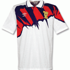
Rude Gullit Posted September 18, 2016 Share Posted September 18, 2016 5 hours ago, romanticscot said: Diadora 05 - 04 Home - Ugly, other than the pinstripe from Fila the only home top I haven't bought in 20 years. - 4 This one? I thought this was a cracker. Quote Link to comment Share on other sites More sharing options...
Guest flumax Posted September 18, 2016 Share Posted September 18, 2016 For the recordFavorite shirt since being in stc/ssc is the fila pinstripe Quote Link to comment Share on other sites More sharing options...
dandydunn Posted September 18, 2016 Share Posted September 18, 2016 (edited) Adidas. Diadora never produced anything like the last 2 away kits. Things of beauty. And it's not exclusive to football kits either. They have the best trainers also. Golf shoes are rather comfortable too. And tracksuit bottoms with dome buttons up the sides Edited September 18, 2016 by dandydunn Quote Link to comment Share on other sites More sharing options...
bonzo Posted September 18, 2016 Share Posted September 18, 2016 Always umbro, liked the fila strips as well. Quote Link to comment Share on other sites More sharing options...
wanderer Posted September 19, 2016 Share Posted September 19, 2016 12 hours ago, hunchy said: Think my favourite top has been the all white diaspora top with the reg plate emblem in the middle. Still love to ware it on a nice sunny day The first one? Yeah, that was the best out of all the Diadora kits (unfortunately its let down by the game it is best known for, plus you get folk who seem to have a problem with us wearing anything that resembles a England kit). 11 hours ago, girvanTA said: Best top in the last 10 years was the white diadora with the saltire on it, an instant cult classic after beating france away As I said earlier, that kit was hated upon its release, yet how much of its affection today is down to Faddy and Paris? After that game you struggled to buy it in any sports shops in the whole country. Quote Link to comment Share on other sites More sharing options...
Donaldo87 Posted September 19, 2016 Share Posted September 19, 2016 Quote The change strip, launched in March 2014, is based on the colours of Lord Rosebery, originally worn by the Scottish team in 1881, and did not go down well. While HFK is all in favour of modern designs that take their inspiration from historical strips, this is an example of what can go wrong. Quote Link to comment Share on other sites More sharing options...
Parklife Posted September 19, 2016 Share Posted September 19, 2016 1 minute ago, Donaldo87 said: I love that strip. One of the finest away kits we have had in a long time IMO. Quote Link to comment Share on other sites More sharing options...
Donaldo87 Posted September 19, 2016 Share Posted September 19, 2016 Just now, Parklife said: I love that strip. One of the finest away kits we have had in a long time IMO. Nah I love it as well. I've enjoyed all the adidas strips - although maybe not the latest home one. Quote Link to comment Share on other sites More sharing options...
Johnnyshaker Posted September 19, 2016 Share Posted September 19, 2016 I've said it ad nauseum to my mates, but the last away kit is a proper classic and people will be wearing it to games in 20 years time. The last home was the best we've had for a while as well, although some people do have a problem with the silver badge which I can understand. Quote Link to comment Share on other sites More sharing options...
kmcca5 Posted September 19, 2016 Share Posted September 19, 2016 (edited) The Gold and dark Blue Diadora top was great. I wore mine so much that I bought it again from Ebay when it eventually looked to tatty for five aside. The one that I have re fallen in love with after coming back into favor with me is the basic white away adidas kit (As shown) I bought it when it was reduced and hardly wore it. In the last six months I have dug it out and worn it for football every week. Classic top, great fit (I have lost about a stone and a half since I bough it and it now looks good on me so might have something to do with it) , simple design. If only they had just done a nice reverse home version like this and I think it would have been awesome. Lots of kits that I have liked in the last few years have gone back to basics. The last France kit for instance (See pic, imagine that it as a Scotland top!!!) was brilliant and designers need to remember that less is more and sometimes just keeping it simple works a treat. Edited September 19, 2016 by kmcca5 Smelling Pisstake Quote Link to comment Share on other sites More sharing options...
Guest flumax Posted September 19, 2016 Share Posted September 19, 2016 4 hours ago, kmcca5 said: The last France kit for instance (See pic, imagine that it as a Scotland top!!!) was brilliant and designers need to remember that less is more and sometimes just keeping it simple works a treat. The French one.... Please make it so Quote Link to comment Share on other sites More sharing options...
romanticscot Posted September 19, 2016 Author Share Posted September 19, 2016 18 hours ago, Rude Gullit said: This one? I thought this was a cracker. That is indeed the one, I do not like it personally. The only thing I do not like is the white line. Quote Link to comment Share on other sites More sharing options...
Batzek-osemba Posted September 28, 2016 Share Posted September 28, 2016 2008 home and away in terms of design but Adidas in terms of fabric and quality. Quote Link to comment Share on other sites More sharing options...


.thumb.jpg.5eeaf0fbe501ba3c868c32fd77caef1f.jpg)
Recommended Posts
Join the conversation
You can post now and register later. If you have an account, sign in now to post with your account.